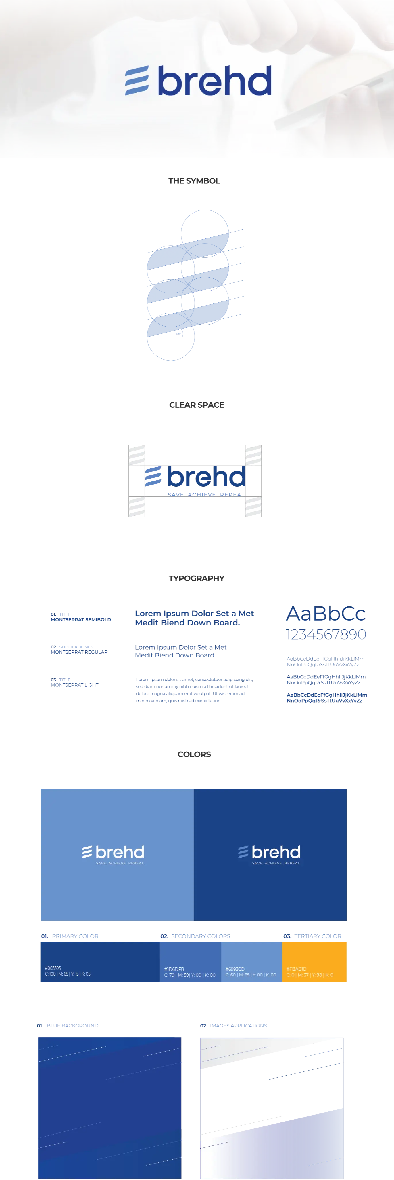
Skip to content

PROJECT OVERVIEW

  • Branding
  • UI Redesign

BREHD: SAVE. ACHIEVE. REPEAT.

Brehd is the way to save! With Brehd, users can organize, budget and achieve goals that would otherwise be far to easy to neglect. A simple and intuitive budgeting app designed to help users prioritize that which is most important to them.

RESEARCH & PLANNING

The Brehd team had a challenge in their hands. How can one standout from the ordinary if everyone looks the same? The first attempt at creating the perfect expression for the brand was met with completely literal representations, making it feel cheap and thoughtless. When the Fahrenheit team was engaged, the mission was to create a beautiful, meaningful and memorable mark. What do you think?

DESIGNING SOLUTIONS

The first iterations of the mark were not a close expression of the brand that Brehd was eager to project. The company principles approached the Fahrenheit Team with the challenge to create a brand expression that would encapsulate the modern look and feel of the app while welcoming new users with a clutter-free presentation.

Brehd is a reference to money, or "bread". Our team took the opportunity to create a lose iteration of a loaf of bread with its scoring (see three marks) to represent the company and it's mission.

Scroll Here
Portfolio Page Portfolio Page

The outcome

The end result couldn’t have been more satisfying. Fahrenheit created a sleek and clean mark that is fresh and memorable. The client was ecstatic with the end result and the company is off to a much better chance to secure the interest of investors.

COME WORK WITH US

Like what you see?
Contact us to discuss your project. We’re ready to help.

Contact Us

This field is for validation purposes and should be left unchanged.