Outline
Get In Touch
Get In Touch
Key Takeaways
It’s a process problem
AI images look “off” when treated as a one-step output instead of part of a structured workflow.AI is raw material
The tool generates options, but creative direction and decision-making still come from the designer.Workflow beats shortcuts
A multi-step process (copy → prompts → generation → refinement → composition) leads to stronger, more on-brand visuals.Iteration is everything
High-quality results come from testing, refining, and discarding—not getting it right on the first try.Guidance drives quality
AI performs best when it’s directed and evaluated by humans, not left to make creative decisions alone.
The Feeling That It's Cheating — And Why That's the Wrong Frame
I’ve had conversations with other designers who feel the same way. There’s almost a puritanical view in some agencies that work only counts if it was done the hard way; in Photoshop, from scratch, with manual hours behind it.
I had to be convinced out of that. Honestly, it took a while. At first, the images weren’t great. You’d give the AI a prompt, and it just wouldn’t give you what you were looking for. But lately, especially using Google Gemini and Adobe Firefly (both use Nano Banana) the quality has shifted to the point where it feels genuinely usable. Not as a shortcut, as a different way of working.
The reframe that helped me most was this: the AI isn’t doing the creative work. It’s producing raw material. The creative decisions, what the image is trying to say, how it fits the brand, what gets kept and what gets adjusted, those are still mine. That’s where the design actually happens.
The key is to do it in a way that the final output doesn’t look like it was generated by AI. That’s not about hiding what you used. It’s about not letting the tool make the creative decisions for you.
Why Stock Photography Wasn't Cutting It
To explain what I mean, I will use a recent task.
I was working on a set of LinkedIn posts that needed high-quality, on-brand imagery. The kind of visuals that feel considered and aligned, not just something placed in the background.
Traditionally, that would involve several hours of going through stock libraries or creating something from scratch. Stock images can be limiting. You often spend more time searching than designing, and even then, the result is usually a compromise. Custom visuals give more control, but they are not always practical when timelines are tight.
So the goal was to create something more flexible. Visuals that were specific to the message, aligned with the brand, and still efficient to produce.
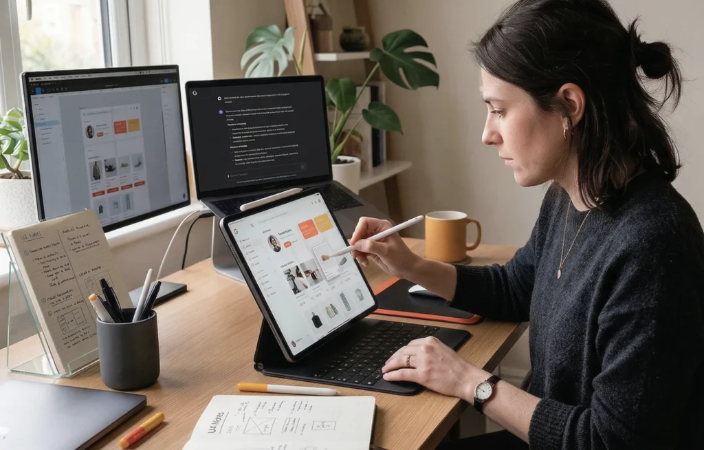
My Generative AI Process
AI plays a role in that process, but it is not the whole process.
The biggest shift is treating it as one tool in a broader workflow, rather than expecting it to produce a finished result on its own.
Step 1: Start with the copy. I read the post first and let the message set the creative direction. The image needs to support what’s being said, not just fill a space.
Step 2: Use ChatGPT to build the image prompts. I feed it the post copy along with brand guidelines — Logic Suite’s colour palette, preferred image style, size, and the general look I’m going for. ChatGPT then helps generate multiple prompt options that are conceptually aligned with both the copy and the brand. I review them, sometimes tweak slightly, and select the ideas I think will work best visually.
Step 3: Generate in Gemini or Adobe Firefly. Both use the Nano Banana model and produce similar results, which is useful when you run out of credits on one and need to switch to the other, which does happen. After the first render, I give additional instructions: adjust the realism, remove an unwanted element, and refine the composition. This iterative prompting is about closing the gap between what the AI produces and what you actually need.
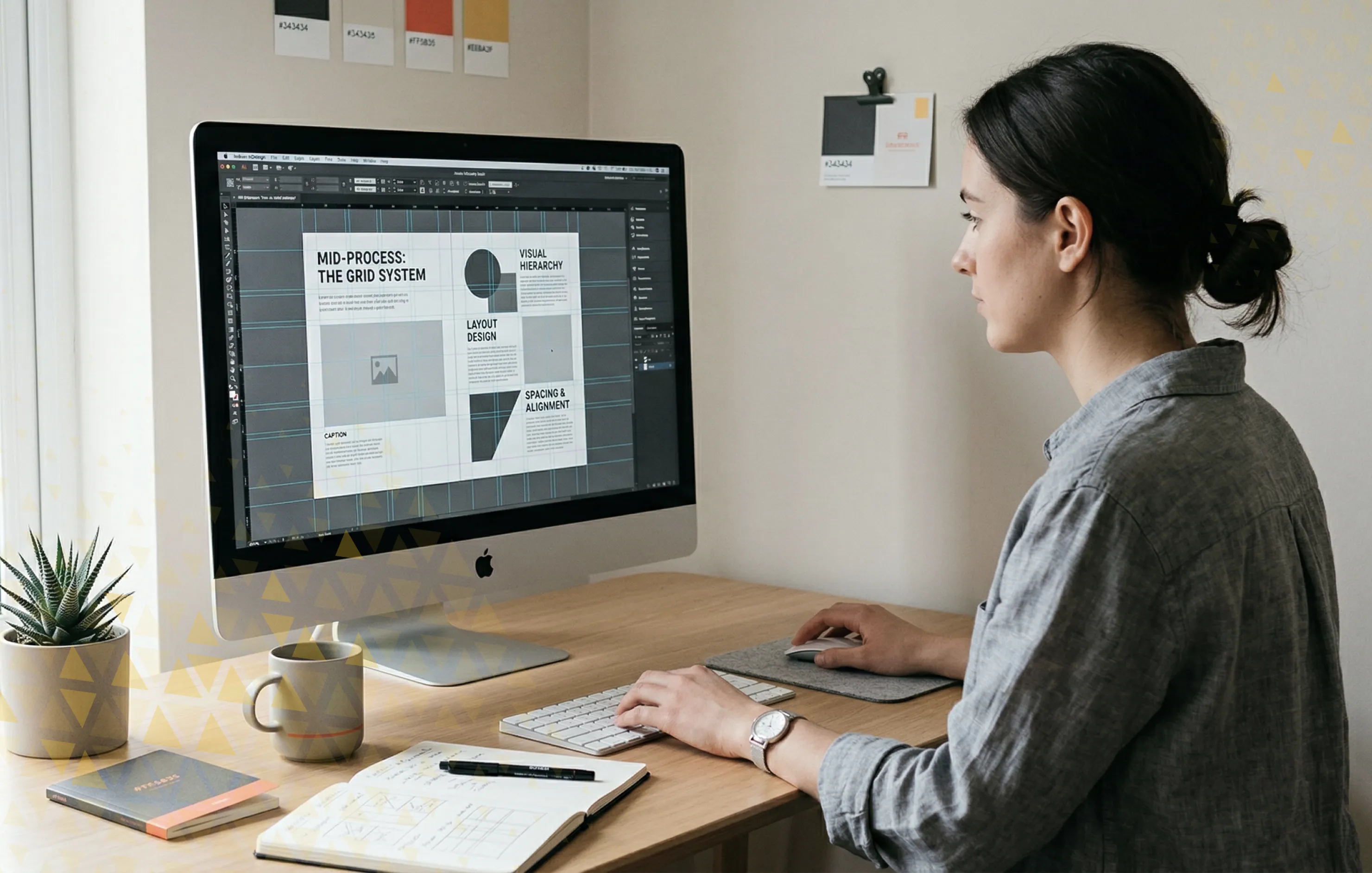
Step 4: Refine in Photoshop. This is where I adjust contrast, colour balance, and other details. Photoshop’s built-in AI tools are useful here too, removing watermarks, erasing elements, or extending the canvas when a different aspect ratio is needed. For images that need higher resolution, I use PixArt to enhance quality before moving on.
Step 5: Finalise in Figma. Logos, overlays, brand elements, this is where the visual composition comes together before it goes to the marketing team. It’s usually the most satisfying part of the process.
What Actually Goes Wrong — The Parts Nobody Talks About
I want to be honest about the frustrations, because the 5-minute version of this story isn’t real.
The images you see at the end of this process are the ones that worked. There were plenty that didn’t. Getting the right prompt is a matter of trial and error, and you only see the good ones because the others were discarded along the way.
Running out of credits on Gemini mid-project is a real problem, especially when you’re generating multiple options for multiple posts in a single week. Switching to Firefly mid-workflow works, but it adds friction. If the volume of posts continues at its current level, the credit limits will need to be revisited.
The other issue is self-evaluation bias, when the AI has committed to an idea and won’t shift away from it no matter how you adjust the prompt. My approach is not to spend too long fighting it. If an image isn’t working after a few attempts, I start a new prompt rather than trying to fix a direction that isn’t working.
Currently, producing three social media post images takes me around 45 minutes to an hour. That includes generating multiple options for each and selecting the ones that best fit the concept. As I refine my prompting, that’s getting faster, but it’s not instant, and anyone setting expectations should know that.
The Result of a More Integrated Approach

The reason AI-generated images often look like AI is that they usually come from a single prompt and go straight into the layout. No refinement, no brand layer, no design decisions applied on top.
Iteration plays a big role. Strong visuals come from refining, not from getting it right the first time.
The multi-tool approach, ChatGPT for prompts, Gemini or Firefly for generation, Photoshop for refinement, and Figma for composition, introduces creative control at every stage. The AI is one part of the chain, not the chain itself. That’s what stops the output from looking like AI.
It also opens up creative territory that stock photography simply can’t reach. Abstract and conceptual visuals, the kind we often need to communicate technical ideas for SaaS clients, are exactly where AI is most valuable. Stock libraries don’t have what you need for that kind of work. AI, used well, does.
Most importantly, AI works best when it is guided. It does not replace creative direction. It responds to it.
Closing Thought
AI-generated images do not have to feel generic or disconnected.
When they are part of a structured workflow, they become much easier to shape and control. The quality improves, not because the tools change, but because the process around them is more intentional.
In practice, it becomes less about generating images and more about building them.
* This blog is part of a series of posts resulting from Fahrenheit Marketing’s Applied AI Roundtable, a weekly session where the team shares their insights and processes for using AI in their work.