Precision Pharmacy Alliance provides training for Pharmacists so they can provide clinical services in physician’s offices. They bring new drug delivery methods and business growth opportunities to the community pharmacy to enhance their network of physicians through training, education on alternative precision medicines.
RESEARCH & PLANNING
Precision Pharmacy Alliance needs a brand to add legitimacy to their company. They are teaching new innovative drug delivery methods. Their logo must reflect that they are forward thinkers. A modern minimal feel would work for a pharmaceutical company.
DESIGNING SOLUTIONS
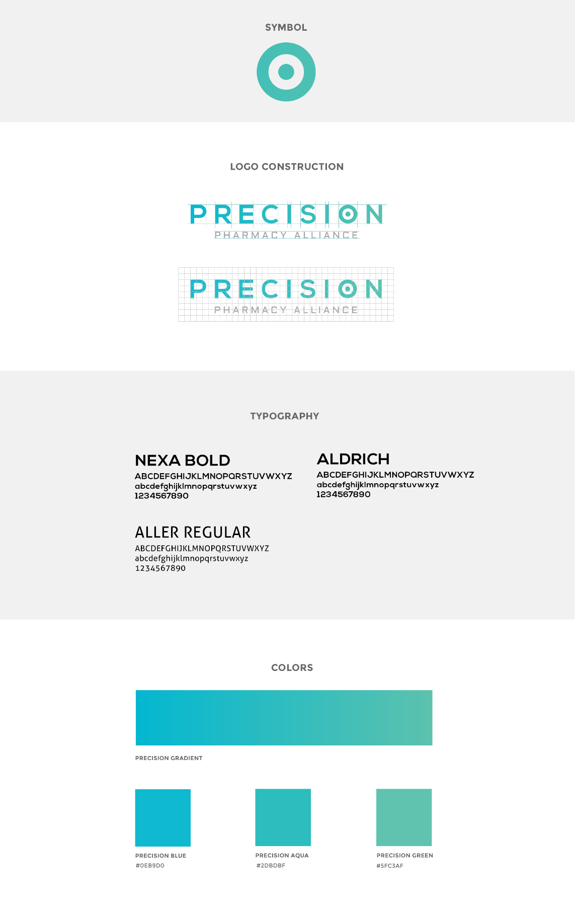
This typographic logo combines the Precision name with the target symbol. The symbol not only plays with the word precision but goes along with PPA's focused strategy. This concept is combined with a gradient color scheme and futuristic typography to highlight PPA's innovation as leaders in the field.
THE OUTCOME
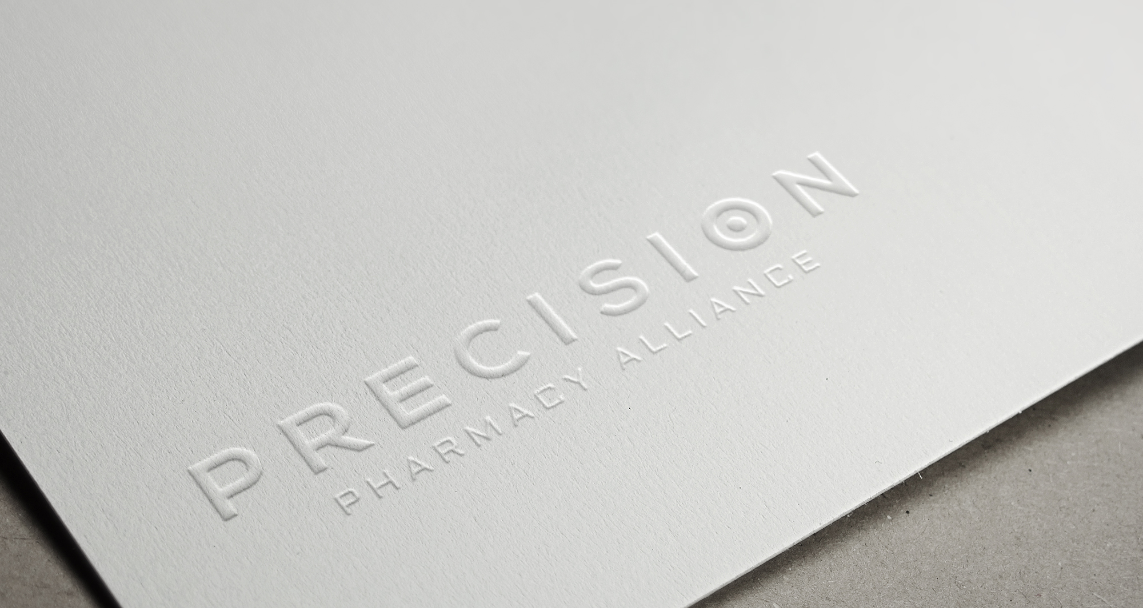
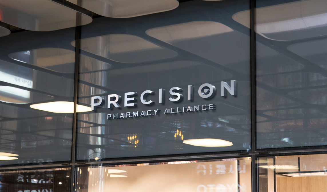
Precision Pharmacy Alliance’s logo helps them put their best foot forward. Their brand represents their strategy while legitimising the PPA vision.
COME WORK WITH US
Like what you see? Contact us to discuss your project. We’re ready to help.